

Getting the look: Tapping into the ‘how and why’ motocross gear catches the eye
Supercross is almost halfway complete and MXGP has started and (maybe?) there is a clear winner for catchy race gear so far in 2026. How do you nail the style?

By Adam Wheeler. Photos by Ray Archer/TLD
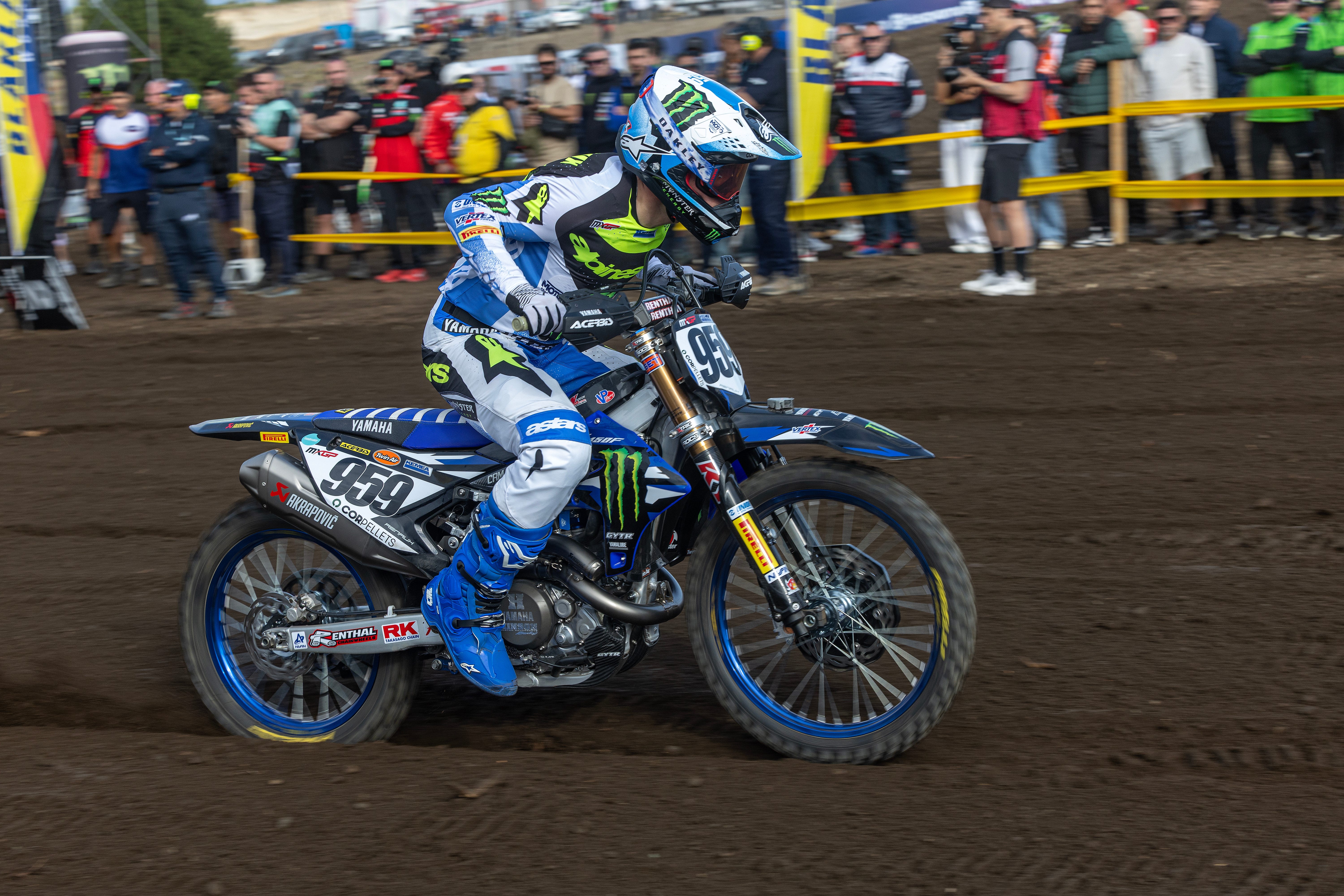
OK, it’s subjective; I know. My idea of ‘cool’ could vary greatly to yours. However, from the nine rounds of 2026 SMX and opening event of MXGP to-date can we agree that Alpinestars seem to be edging ahead in the style-stakes? Their Supertech, Techstar and Racer gear lines (all with varying levels of features, functions and tech within the fibres or construction of the jersey and pants) just seem to pop or gel aesthetically with their racers and their motorcycles. Eli Tomac, Chase Sexton, Hunter Lawrence, Simon Längenfelder and Maxime Renaux/Tim Gajser have been unmissable (and easy to spot) on track and the Limited Edition offerings have sprinkled extra fairy dust. For a gathering of the product then check out the link HERE.
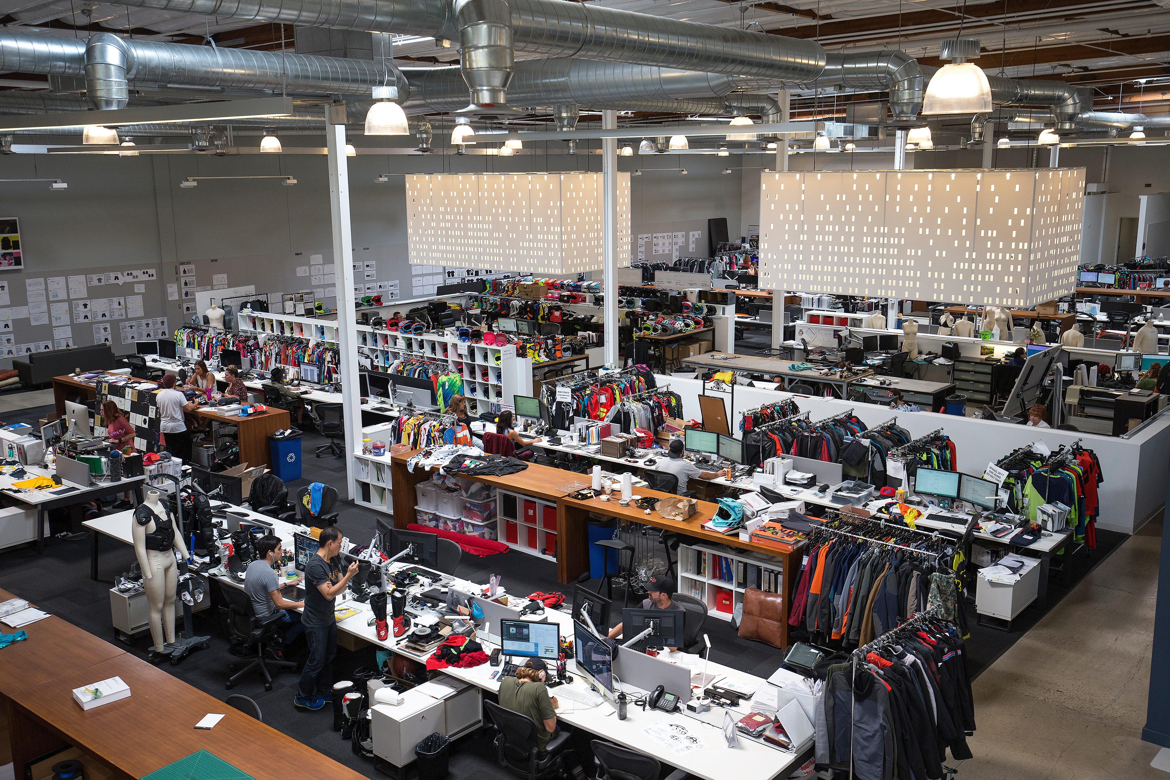
Through 13 years with ‘On-Track Off-road’ magazine, I was lucky to speak to a number of people in the industry about the creative process of motocross apparel. There were clearly two sides to the development: the graphics and colours, and then the R&D with materials and fabrics as brands rushed to make lighter, tougher, stretchier, better performing (moisture-wicking) and better fitting garments. Each side complemented the other. Nobody would buy the latest textile engineering if it looked dated or boring and the same could be said for appealing designs on cheap items that would soon fall to bits.
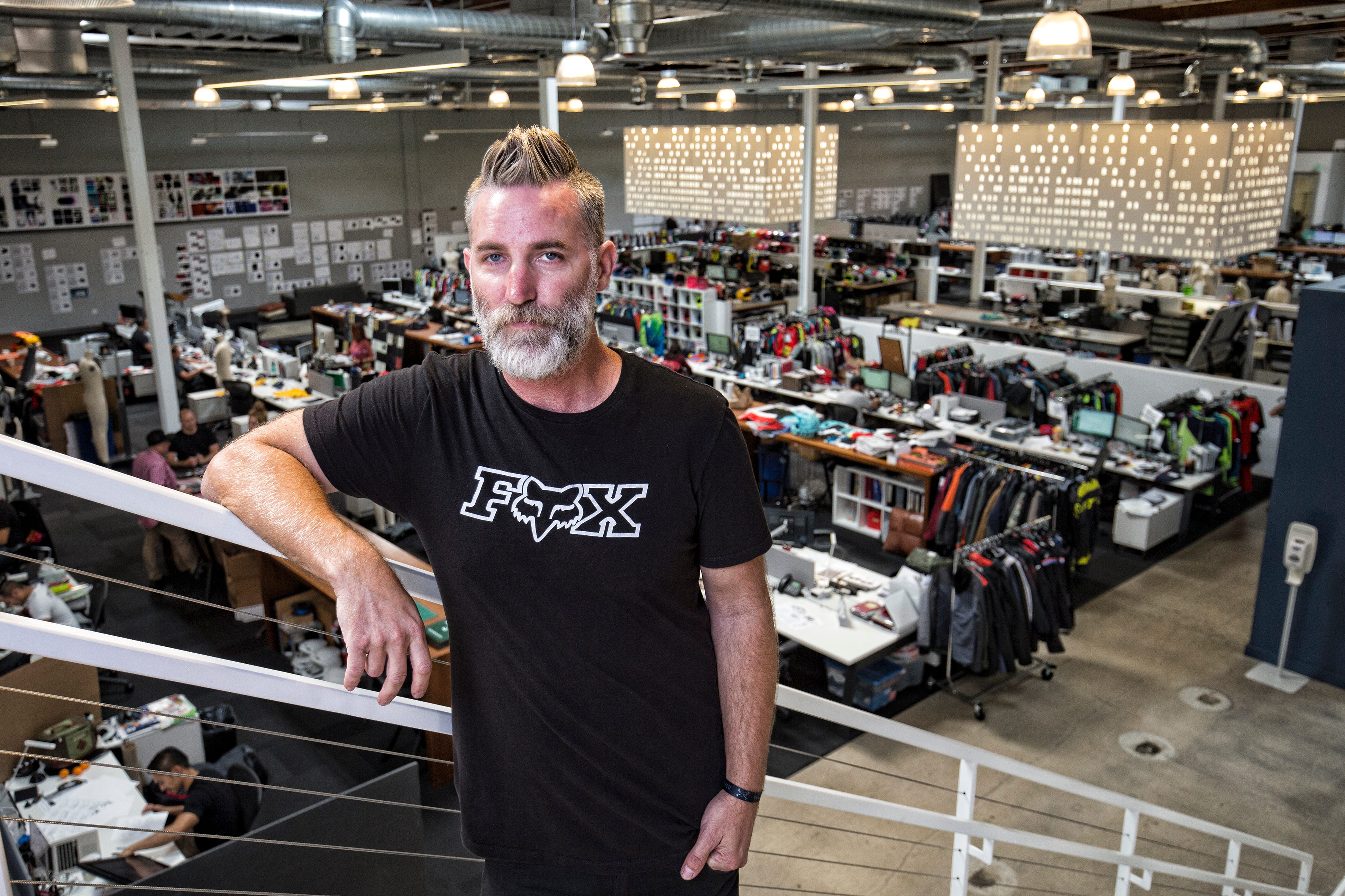
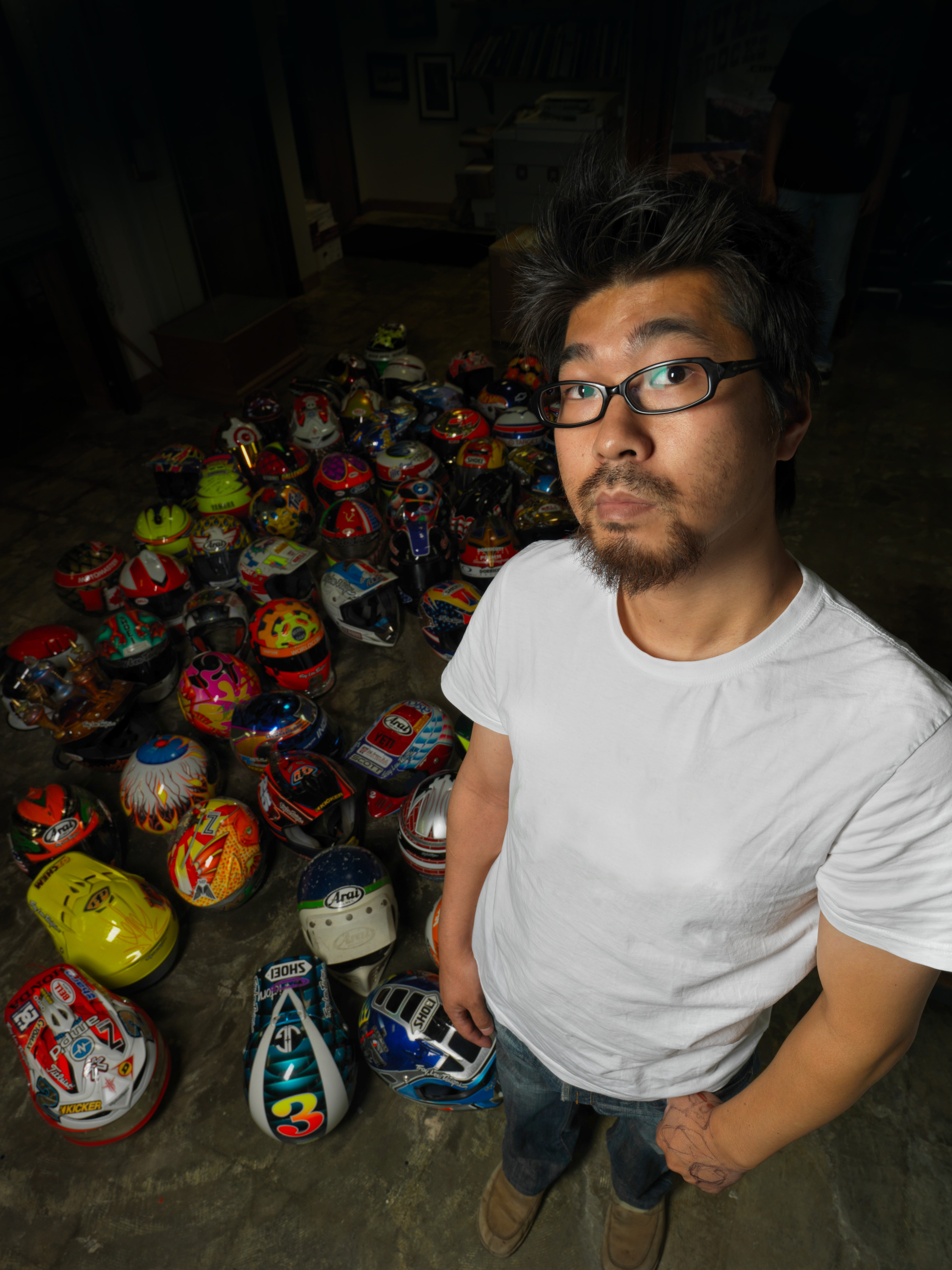
I wasn’t surprised that some of the leading design figures of the last decade, like Dave Durham at Fox, Marc Blanchard at 100% or Maki Ushiroyama, a long-term Troy Lee Designs pioneer, were taking their cues and stimuli from diverse sources. “Many visual places like Instagram, Pinterest but also just going out and watching people, shopping malls, museums and art: daily stuff,” Ushiroyama told me in a fantastically open and personal interview at the TLD office, pre-pandemic. “I’ll even go somewhere like the opticians and think ‘oh, those graphics are quite cool’. It’s easy to get inspired.”
What was eye-opening was the lead times; the guessing game of predicting consumer’s tastes in the future, and the gamble to set trends in terms of blocks, shapes, presence, lettering and more, a year sometimes two or three in advance. As entities like Alpinestars market and sell their 2026 range, the 2027 line-up will be ready to go and design teams will already be thinking about 2028. When Fox launched their innovative Flexair a decade ago it years in the making and was an example of how the aesthetic had to sync with the performance aspects: the emergence of four-way stretch and athletic fit.
“I think it was around four years of development to make that happen,” Durham told me. Dave is an industrial designer who was head of Fox’s creative team of 20 people at the company’s hub in California. He was at the firm for two decades until setting up his own shop ‘The Followed’. “It was a challenge to buck the system and go from a highly durable feel-and-effect 900D fabric to a stretch material and to still have it durable enough, and perceived to be strong enough. It was a challenge internally - and also externally - but I feel like we found the right fabric and it ended up being a great product for us.”
“Deadlines come fast so you have to make informed decisions very quickly,” he said. “Sometimes you don’t have the breath to explore more…and in design you can often explore endlessly! It is hard to say ‘right, I need to draw a line and take a direction with this’ because you often feel you can push it a bit more.”
Troy Lee Designs, renowned for their helmet art but also their impact in other products, counted on Ushiroyama’s leanings and vision for thirty years. The Japanese then launched the Groove Machine Inc but TLD still seems to be the principal client. Maki was insightful, and willing to share his methodology as well as outline the compromises of the job.
“It’s where the ‘good designer’ or ‘bad designer’ kicks in because a good one will know there is a limit to what a certain fabric can do aesthetically,” he described. “Sometimes it can be as simple as a colour block or even just a colour to get the ‘wow’ factor and bring in the newness. Troy Lee Designs is a graphic-driven product company, that’s what we are known for, and I want to push a lot of graphic into the product but at the same time I am also the one that is eliminating graphics. A lot of the time the mentality can be ‘more is more’ but I have a ‘less is more’ mentality too: stripping back graphics to get to the core design. I think Troy started getting it; an empty space to him is scary. He has to fill it in some way. To me it can also be beautiful and can complement something else. It is all about the balance. To me, a single colour can still be a graphic! When it is super-simple it can blend in. It kinda becomes like a wall.”
“I’m a product designer with a graphic designer mind,” he added. “It’s like I design the form of an F1 car, but I am also responsible for the livery as well. Both are equally important. Functionality without style means that people will think something is ugly. A terrible graphic will ruin the first part of the product. So, you have to marry both together.
Focusing more on the artistic side, where does it all stem from? “Coming up with designs is never an issue,” Maki said. “I have almost way-too many ideas. I have ten+ years of sketchbooks full of stuff. There has to be a bit of heart and soul in the stuff that comes out. That’s why sketching works. I cannot go straight to a computer or a screen. It is small things, small doddles: many ideas where you just connect the dots. Sometimes you get lucky, sometimes you don’t, and sometimes you can get too far ahead: it might be an idea that is already ten years old but it’s still not ready for the market. I can be late too! I might have a great idea but someone has already done it. I might have made something look a bit different…but it was not exciting enough.”
“I love creative energy,” Durham explained. “I love architecture, but when it comes down to inspiring our line and what we do every day then what really affects it most is very creative people. Usually, it surrounds some kind of underground culture and the expression; it could be custom bikes to what people wear to separate themselves at a music festival. It is about how people are really passionate about something. Usually there is something that drives these people to be individual and make some inspiring stuff.”
“Every couple of months I have to download the contents of my phone and organise it,” Maki said. “Half of the stuff I’d had similar ideas…but the other half is very new and I don’t know what to do with it! If I think something is cool then it is already brewing, and in my heart, I am ready to use it. The new stuff is also exciting…and I think ‘how can I link the ideas?’ or ‘how will one link or bounce to the other?’
It seems that the fear of the ‘blank page’ doesn’t really exist for these designers. But then they are constrained by the ticking clock of product timelines (Maki: “we are all driven by the deadline right?! Those ‘oh s**t’ moments can also bring up some ideas…”), the ingenuity of the competition and then the worry of repetition.
“I like to hire competitive designers…and I am also like that,” Durham said. “If I look at the track over a weekend and I see something [good] that someone else has done then it kinda irks me.”
“Priorities. The first is: did I come up with an idea that nobody has? If we have a second year of gear and it has the same feel or vibe as the one before then I reject it,” Maki says. “The sales guys want something comfortable so they can sell it all day long - so we have something that looks like TLD but also the regular stuff - but I try not to go there. My job is to try and bring something original. Doing something timeless is always my design ‘street’.”
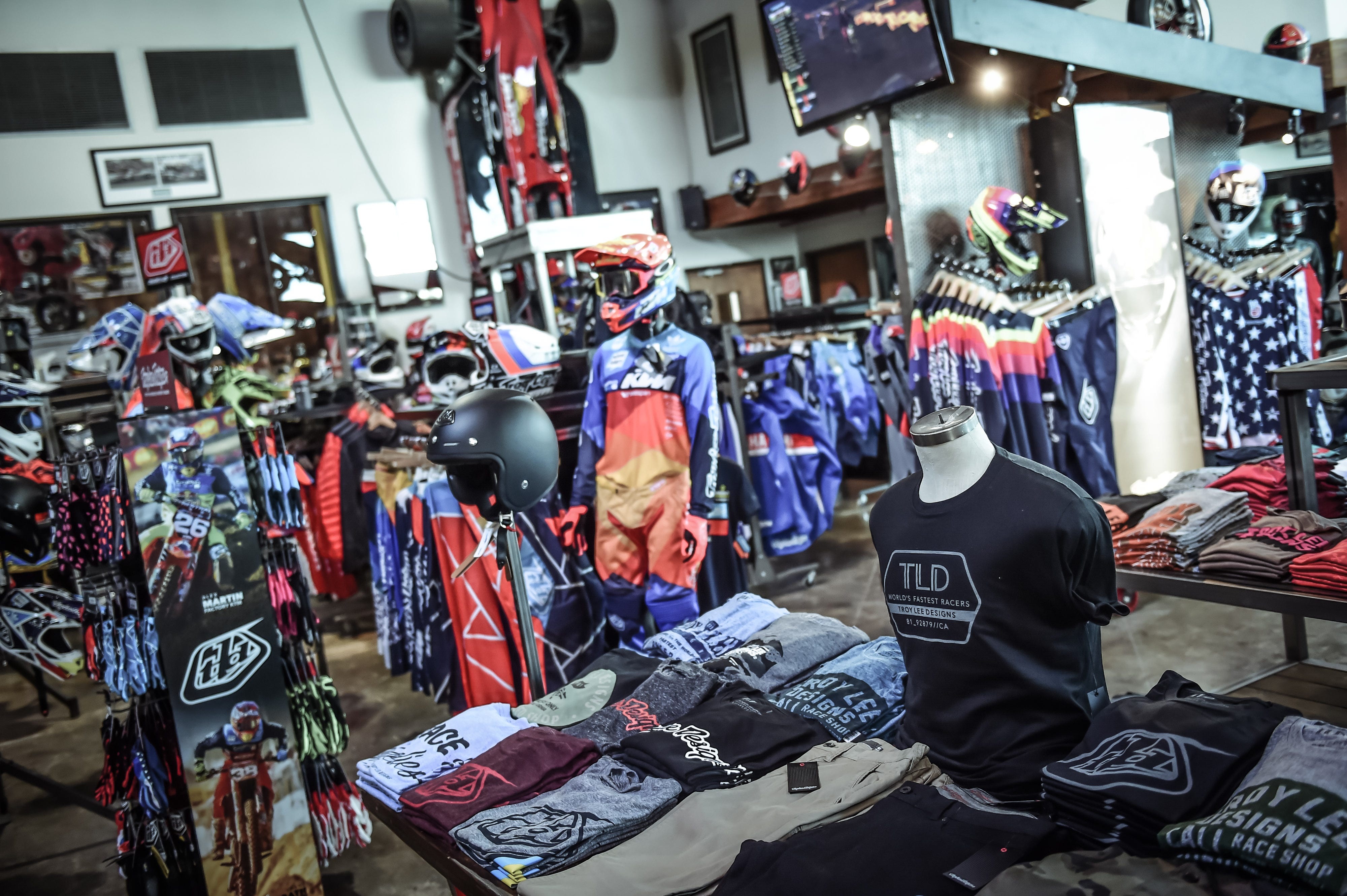
While Fox can call on classis designs like the zebra or cobweb schemes, for TLD the Polka dot livery raised some eyebrows. “It definitely shocked a few people and turned some heads,” Maki recounted. “And a lot of people hated it! The industry wasn’t ready and – although I don’t want to pat my own shoulder – I did something to wake everybody up. It was time to change. When I showed Troy for the first time he ‘got’ it; he knew that everybody would hate us. I said ‘are you ready? Because I believe in it’ so we went with it: TLD style. It kinda sold OK. It’s not like we sold millions of sets…but it was another to cover the costs.”
TLD also caused a stir in a brief alliance with sportswear giants Adidas, initially for shoes but then for the premium Ultra LE riding gear. Ushiroyama’s story about the union shows how the curiosity and creative might of two prominent teams can come together.
“A representative from Adidas came up to us and said ‘Hi, I work in the Future Department’…and we said: ‘What does that mean?!’ He was part of the advance team that is working on projects five-ten years ahead. They were keen to have some of Troy’s artistry on some of their products and we thought ‘that’s cool!’ First of they gave us a small range of shoes and asked us for the TLD ‘touch’ as we’d done with helmets. We did a bunch and they loved it and that triggered all the next steps. They did a study for us. I remember them saying: ’this is a new fabric, by the way its hundred dollars a yard!’ It was a bit advanced for the market but they made a prototype mock-up and a video to show all the stretch. If Adidas were going to make a motocross pant…then that’s how it would be. We were shown a presentation and we were blown away.”
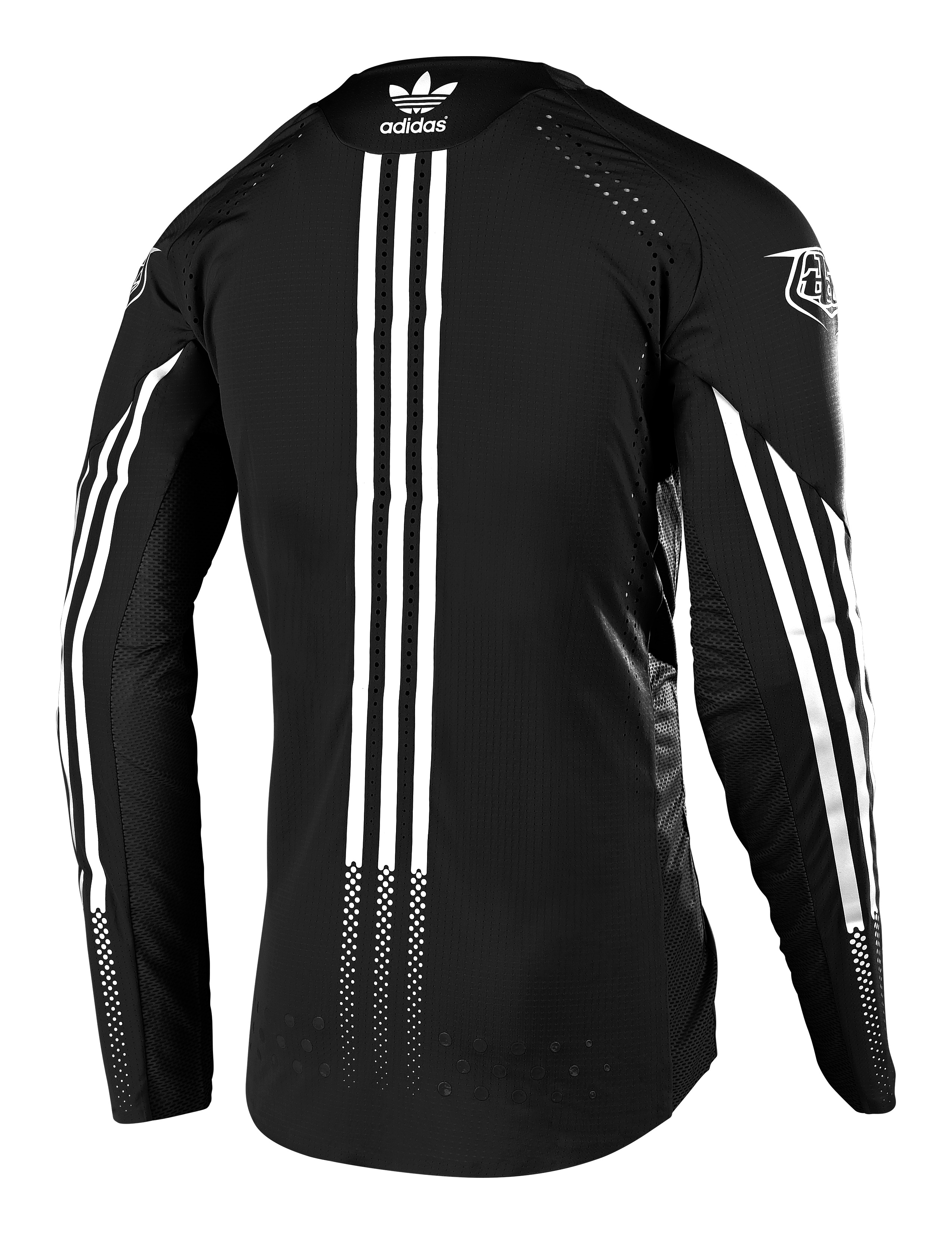
The Ultra LE was quite reserved by TLD’s standards. “They give us a little more freedom…but the true story is that we couldn’t put much of a graphic because of the nature of the fabric. There is a lot of multi-functional stretch. It is very calculated and if that is the main marketing story then maybe we don’t need a graphic.”
Back in 2019 Ushiroyama may have had more creative licence than others thanks to Troy Lee Designs’ slight independent and alternative status but that didn’t mean he could freestyle wildly. “If our gear and graphic is presented without the logo can people still identify our look?” he poised, rhetorically. “Sometimes it is graphics, sometimes colours, sometimes shape. Of course, we are living in a ‘make the logo bigger’ world! Somehow people still love the big logos. I’m the first person to want to remove logos and just let the graphic speak – which I have started to do here and there – but every time I do that then I have to be aware that people are also buying as a branding/bonding loyalty thing. I understand that. So, it’s a balance again.”
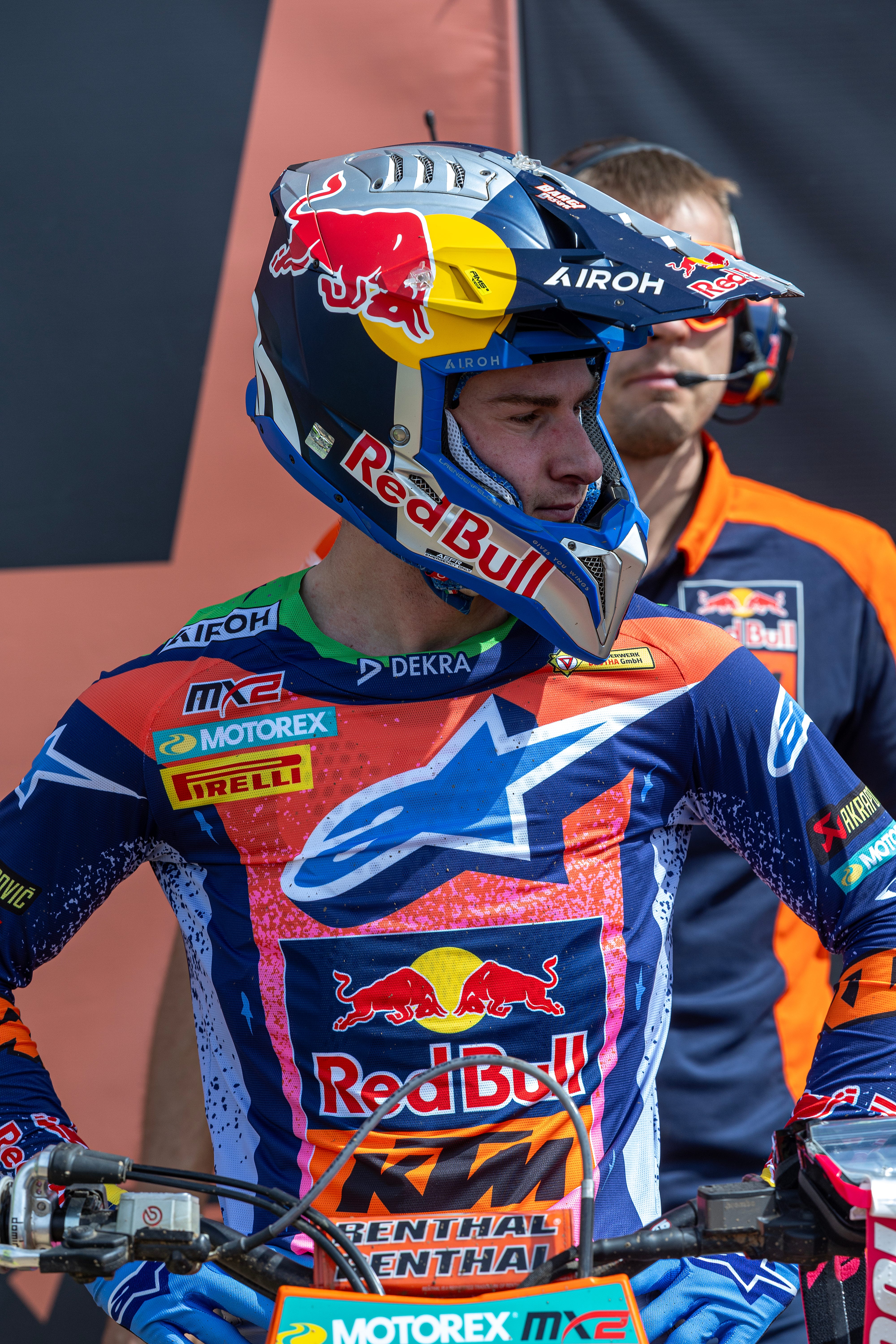
Some gear can be applied to specific partnerships: Fox with HRC (and they are currently in a very high-vis situation with Jeffrey Herlings, Tom Vialle and Ruben Fernandez in MXGP) and Alpinestars with Red Bull KTM and Monster Energy Yamaha (the blue/yellow Techstar Knif line suits the Renaux/Gajser pairing nicely). Fly Racing with KTM as well.
But spare a moment for the teams and the forces behind the items that racers are using and testing. Elite product design is rife in so many areas of motorsport, but motocross and supercross permits an extra artistic edge; a place where a flash, a spark and an idea can influence more than just the stopwatch. This brings its own satisfaction but also extra angst.
“When I design and finish the concept then I am the ‘king of the world’!” Maki grinned at me. “I’ll think ‘this is the best design I could come up with’ but then I’ll look at it again in the next days and think ‘oh man, that’s s**t!’ It’s like writing a love letter in the night and you read it the next morning and you’re like ‘what was I thinking?!’ Same thing! But I will go back and make sure it will be the best design I can do at that time and be confident in it enough to present it, whether it’s to a customer, the sales department or Troy. At least I will have put 100% into it. If it doesn’t sell…then tough s*t! I’ll do it again and keep trying, keep trying.”
Perspiration is a given, but the weight of inspiration and science that flow into the ‘best looking’ kit is gloriously uneven; hemmed by deadlines and then judged by the public and consume. Or…it could be as simple as Maki states: “A good rider makes everything look good.”
Fascinating piece, and I agree Alpinestars is on point.